
Color does something to a room that almost nothing else can. It sets the temperature, the mood, the entire personality of the space, and it does it before you’ve even consciously noticed. So if your living room still feels like autumn even though the sun is blazing outside, the color palette is probably why.
The good news is that shifting your summer living room color palette doesn’t mean repainting your walls or buying new furniture. In most cases, you’re working through textiles, accessories, and accent pieces: swappable, affordable, and reversible. Here are the palettes that are genuinely working in 2026, why they work, and exactly how to bring them into your space.
Why Your Color Palette Matters More in Summer
In winter, we lean into warmth. Dark tones, rich textures, layered rugs, all of it creates a cozy, enclosed feeling that’s perfect for cold months. Summer asks for the opposite. Lighter, cooler, and more open is the goal.
There’s actual science behind this. Cool colors (blues, greens, soft whites) reflect more light and create a visual sense of spaciousness. Warm, heavy tones absorb light and make a room feel more compressed. Your brain registers the difference even when you’re not thinking about it. That subtle feeling of “this room just feels heavy” in July? That’s your color palette working against you.
The trick is knowing which summer palettes feel fresh rather than cold, energetic rather than overwhelming, and timeless rather than trend-chasing. Here’s what’s delivering in 2026.
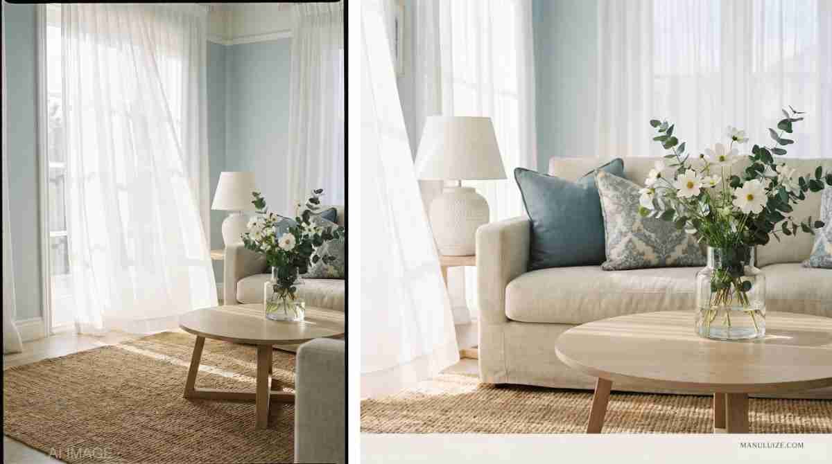
Soft Blue and Crisp White
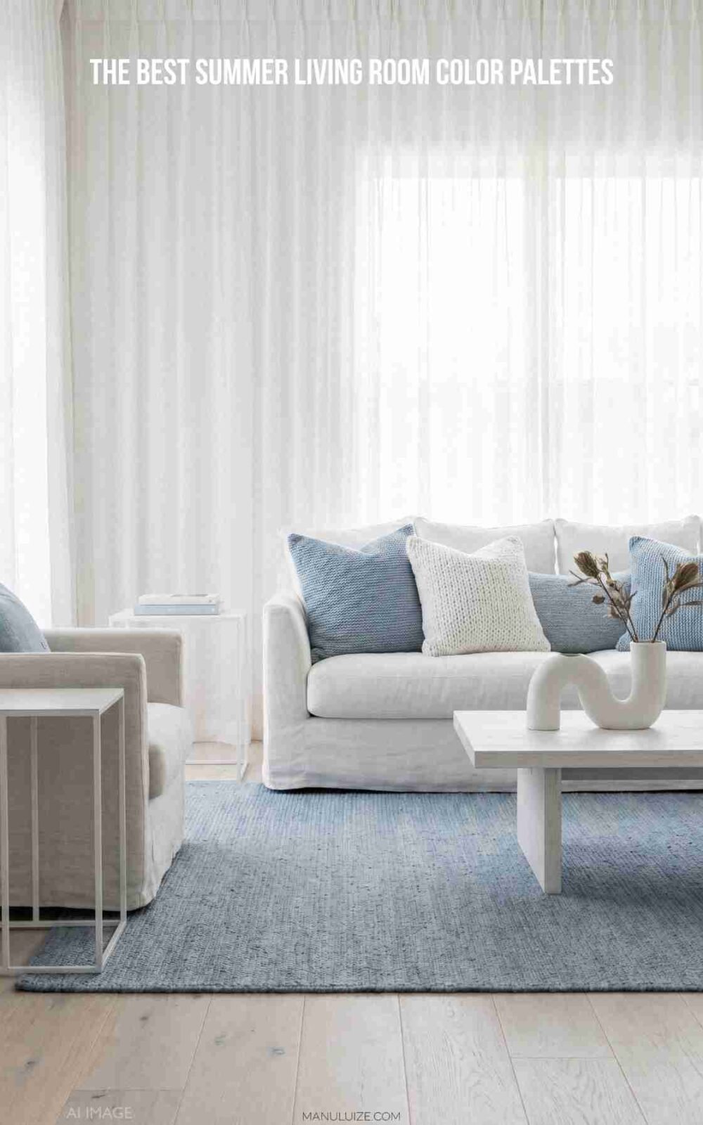
The timeless summer classic for a reason. Soft blue combined with crisp white is the palette that never really goes out of style, and in 2026 it’s everywhere again, but with a more sophisticated, restrained approach than the nautical versions of a decade ago.
The key word is soft. You’re not going bold cobalt here. Think:
- Dusty blue: a muted, slightly greyed blue that reads as calm and elegant
- Coastal blue: lighter, with more grey than navy, like the horizon on an overcast beach day
- Pale aqua: fresh and lively without being overwhelming
Pair any of these with crisp white walls or white upholstery, and you immediately have a room that feels airy and summer-ready. Add warm natural wood tones as a grounding element to stop the palette from feeling cold.
How to use it: Start with a set of dusty blue linen cushion covers on a white or cream sofa. Add a white ceramic lamp and a simple glass vase with eucalyptus. That’s genuinely enough to shift the entire room.
If you want to take this palette further, check out our guide to coastal summer living room decor for a deep look at how to layer this style all the way through a space.
Warm Cream and Sandy Beige
The palette that makes every room feel like a holiday. Cream and sandy beige create a warm, sun-bleached quality that’s immediately relaxing without being cold. This palette works beautifully in rooms that get a lot of natural light, where the tones glow rather than flatten.
Think of it as the Mediterranean approach to summer color. Whitewashed walls, warm stone floors, linen everything. You’re not adding color so much as stripping back to warmth and simplicity.
This works particularly well if:
- Your existing furniture is dark wood or dark grey
- Your room doesn’t get huge amounts of natural light and you want to maximise brightness
- You prefer understated, quiet elegance over bold seasonal statements
How to use it: Swap your current cushion covers for cream or oat-toned linen ones. Add a jute or sisal rug if you don’t already have one. Place a few sandy-toned ceramic objects on the coffee table. The room will feel effortlessly summery without a single loud color in sight.
Sage Green and Off-White

The fresh, botanical palette that’s been gaining serious momentum. Sage green hit interiors hard a couple of years ago and it’s not leaving, because it genuinely works. It’s a color that reads as natural, organic, and calming, which makes it perfect for summer spaces where you want to blur the boundary between indoors and outdoors.
Sage green pairs brilliantly with:
- Off-white or warm cream: for a soft, natural look
- Natural wood tones: rattan, oak, and bamboo all sing alongside sage
- Terracotta accents: for a warmer, earthier take on the palette
- Dusty pink: for a softer, more feminine interpretation
What makes this palette work so well is that sage green doesn’t shout. It sits quietly in the background and makes everything around it look considered. IMO it’s one of the most versatile summer colors you can work with.
How to use it: A sage green throw on a cream sofa, a small potted plant in a terracotta pot, and a linen cushion in off-white. Three elements, one cohesive palette, done.
Coral, Terracotta, and Warm White

For when you want summer to feel warm and joyful, not just breezy. This palette brings the energy of a golden afternoon indoors. It’s warm, inviting, and full of personality, but it needs to be handled carefully or it tips into overwhelming very quickly.
The trick is keeping the base pale and letting the warm tones be accents. White or very light cream walls and upholstery are essential here. Against that pale base, pops of coral and terracotta feel vibrant and alive rather than heavy.
- Coral: energetic and happy, best used in cushions or small decorative objects
- Terracotta: earthy, grounded, works beautifully in ceramics and plant pots
- Warm white: the base that lets both of the above breathe
This palette looks particularly stunning alongside natural materials. A terracotta pot, rattan furniture, and linen upholstery create a space that feels like the best kind of summer afternoon. Pair these warm tones with the right summer throw pillows and you’ve got a genuinely cohesive look that photographs beautifully too.
How to use it: Two coral linen cushions on a white sofa. A cluster of terracotta-toned ceramic pots with plants. A warm white or cream throw. Keep the rest of the room neutral and let these pieces do the talking.
Navy, Rattan, and Warm Gold

The sophisticated summer palette for people who don’t want to go light and airy. Not everyone does, and that’s completely fine. Navy combined with warm gold accents and natural rattan materials creates a summer space that feels rich and considered rather than beachy and breezy.
This works especially well in rooms with traditional or classic furniture, where something like dusty blue and white might feel slightly at odds with the existing aesthetic.
Key pieces for this palette:
- Navy cushions: deep, saturated, and grounding
- Gold or brass accents: table legs, lamp bases, picture frames, candle holders
- Rattan or wicker: brings warmth and texture to stop the palette feeling formal
- Warm cream or ivory: essential as a lightening element, prevents the palette going too dark
This is the summer palette for people who appreciate that summer doesn’t have to mean pastel. Bold can be seasonal too.
How to use it: A pair of navy cushions alongside ivory ones. A brass-framed mirror or a gold-toned lamp. A wicker tray on the coffee table. Small moves, big impact.
All-White with Textural Interest

The boldest summer move is sometimes no color at all. An all-white or near-white summer palette sounds stark, but when you layer it with varied textures (linen, cotton, rattan, ceramic, natural wood) the result is a room that feels like pure summer light.
This palette is about texture doing the work that color usually does. The contrast between a smooth white ceramic vase, rough-textured linen cushions, and a woven jute rug creates visual interest without a single drop of color.
It works best when:
- Your room gets strong natural light
- You have interesting architectural features (exposed beams, interesting window shapes, good floor material)
- You genuinely enjoy the calm, spa-like feeling of a restrained space
How to use it: White or ivory cushion covers in at least two different textures. A jute rug. White ceramic objects in varying shapes and sizes. Natural wood or rattan accessories. The key is buying into the approach fully, half-committing to all-white doesn’t work.
How to Apply Any Summer Color Palette
Regardless of which palette appeals to you most, the process for applying it is the same:
- Start with your largest textile first: the sofa cushions. This sets the tone for everything else.
- Add the rug next: it grounds the palette and ties the room together.
- Layer in accent objects: vases, trays, candles, books. These carry the secondary and accent colors.
- Add plants last: greenery works with virtually every summer palette and adds the organic quality that stops a room feeling too designed.
- Step back and edit: remove anything that’s fighting the palette. If something doesn’t belong, trust that feeling.
The most common summer color palette mistake is trying to use too many colors at once. Pick one or two dominant tones, one accent, and let those three do all the work. Everything else should be neutral.
The Colors to Retire This Summer
Just as important as what you bring in:
- Deep burgundy and wine tones: gorgeous in winter, too heavy for summer
- Dark forest green: replace it with sage or mint
- Burnt amber and rust: autumnal, save them for September
- Charcoal grey in large quantities: one piece is fine, but grey-dominant rooms feel heavy in July
Your summer living room color palette is the foundation that every other seasonal choice sits on. Get the palette right and everything else becomes easier. For more on how to put the whole summer living room look together, head back to The Ultimate Guide to Summer Living Room Decor (2026).
Pick your palette. Start with the cushions. The room will do the rest.


